A routes-first method that uses AI and a live analytics connector to discover the journeys agents actually take — then quantifies only those. It turns a guessed funnel into an audited, defensible bottleneck the whole team can trust.
The usual move is to sketch the steps you think users take and build a funnel against them. If the guess is wrong, the numbers are confidently wrong — and stakeholders act on them anyway. An earlier strategy doc had done exactly this: predefined funnels against an assumed flow.
I replaced the guess with discovery. The method has one rule: let the data tell you the routes before you measure any of them.
A reverse journey ending on the target action surfaced the real inbound routes from session data — rather than me deciding what they should be.
Each top route rebuilt as an ordered, same-session funnel and computed for conversion and per-step drop-off. Discovery finds the paths; funnels grade them.
Sampled agents logged anywhere from 7 to 69 sessions each. Counting sessions would have wildly over-stated volume; unique-user funnels remove the skew.
Completed sessions sampled to confirm the picture: all desktop, production, agent-only — no mobile, no customer self-serve muddying the read.
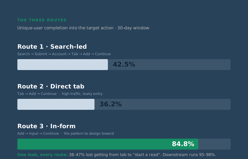
Scoped to the dominant client — roughly 89% of production volume — three routes explained the journey into the target action. They disagreed on efficiency but agreed on where the loss happened.
| Route | Path | End-to-end | Verdict |
|---|---|---|---|
| 1 · Search-led | Search → Submit → Account → Tab → Add → Continue | 42.5% | Most used — cleanest read of the leak (46.7% drop at “start a read”) |
| 2 · Direct tab | Tab → Add → Continue | 36.2% | High traffic, leaky entry (38.1% tab → add) |
| 3 · In-form | Add → Input → Continue | 84.8% | Most efficient — the pattern to design toward |
The signal was unambiguous. Every route converts at just 38–47% across one step — getting from “opened the meter tab” to “started a read”. Everything after it runs at 95–98%. The problem isn’t data entry; it’s intent lost before the form even begins. That single, located bottleneck became the anchor for the UX audit’s highest-leverage fix.
A tempting cut was to split routes by user type — internal ops vs client-side staff — using email suffix. But the platform masks email on the user record by design, so the suffix couldn’t be read reliably.
Rather than present a half-computed split as if it were solid, I parked it, documented exactly what would be needed to complete it (an internal ID-to-domain mapping), and kept it out of the deck and dashboard entirely. A confident wrong number is worse than an honest gap.
This is reusable. Any high-frequency flow can be run through the same four moves — discover, quantify, count honestly, validate — to produce a bottleneck you can actually target. It’s the quantitative half of a qual-plus-quant practice: behavioural evidence to locate the problem, research to explain the why, and design to fix it.
Built and run by one person, but structured so anyone can follow the method and reach the same, defensible answer. That’s what makes it a foundation to scale on — not just an analysis that happened once.