Case Study 01 · Flagship

The Ignition
UX Audit

Six separate initiatives — AI training, live data connectors, a design-system build and a two-week heuristic audit — unified into one repeatable workflow that surfaced, prioritised and prototyped UX wins for a high-traffic agent task UI.

Role  UX / Product Design Lead — sole designer· Scope  Analysis · heuristic audit · prototyping · playback· Timeframe  Weeks 1–2, June 2026
7,405
unique agents analysed across the core meter-read journey
38–47%
the single funnel step where the journey leaked
84.8%
completion on the most efficient route — the target pattern
2
prototyped concepts: constrained fix vs greenfield flow
The challenge

A daily task, quietly leaking intent

Ignition is the platform energy-supplier agents live in all day. Collecting a customer’s meter reading is one of its highest-frequency tasks — and the flow looked fine. Agents completed reads; nothing was visibly broken.

But “nothing visibly broken” is exactly where behavioural evidence earns its keep. The organisation was standing up a new behavioural-analytics capability and, in parallel, I was formalising an AI-assisted design workflow. The opportunity was to prove both at once: could we move from opinion-led tweaks to a defensible, prioritised set of UX changes — in two weeks, as a team of one?

The goal wasn’t a prettier screen. It was a repeatable way to find the right screen to fix — with evidence a whole team could act on.

The Approach

One workflow, built to repeat

Rather than a one-off audit, I built the audit as a system — a structured Claude Code project where context, data and design all live together and every decision is logged.

Structured the project for AI

A top-level repo with shared business context and per-domain folders, plus persistent instruction files so every AI session starts already knowing the role, rules, personas and goals.

Made context explicit

Global and project instruction files, a weekly decisions log and a learnings log — the difference between a clever one-off and an operating model.

Connected live data at source

Two MCP connectors wired straight into the workflow: FullStory for behavioural journeys and funnels, and Figma for design tokens and component awareness — with a research insights backlog alongside.

Briefed two concepts in parallel

Flow diagrams uploaded as source; then App 1 (a constrained fix that respects today’s layout) and App 2 (a greenfield optimal flow) briefed against the same evidence.
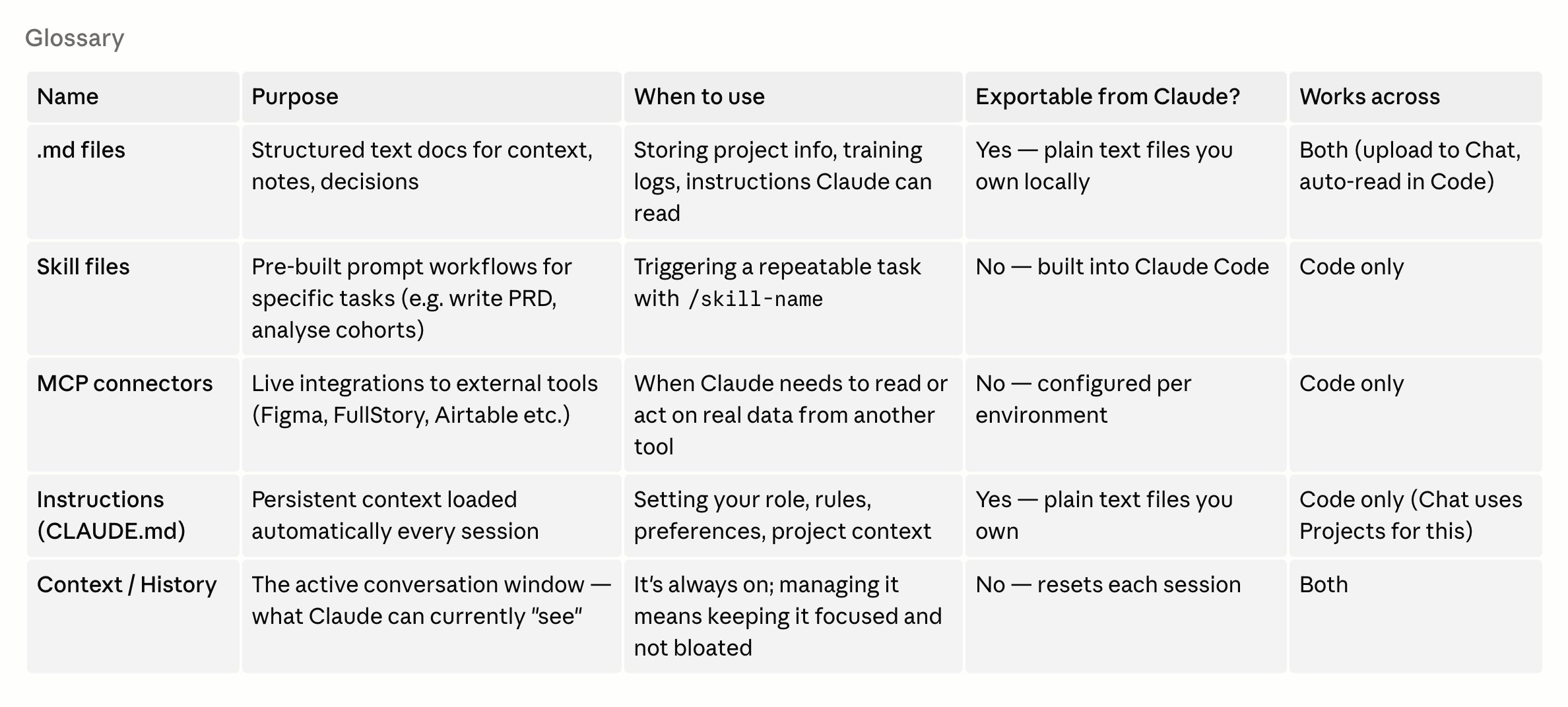
A plain-English glossary of the AI workflow
Making the setup legible. Part of the operating model: a plain-English glossary of the moving parts — persistent instruction files, reusable skills, and the live MCP connectors (FullStory, Figma, research) — so the whole team could understand and trust the workflow, not just me.

Journey Analysis

FullStory

The temptation with funnels is to invent the steps you expect and measure those. I inverted it: use behavioural journeys to discover the routes agents actually take, then build funnels only for the top paths. Counting by unique users, not sessions, because heavy agents log dozens of sessions each and would skew everything.

Route 1
Search-led — 42.5% end-to-end. The cleanest read of the leak: a 46.7% drop at the “start a read” step.
Route 2
Direct tab — high traffic, leaky entry. 38.1% from tab to add.
Route 3
In-form — 84.8% end-to-end. The most efficient pattern; the one to design toward.

The finding that mattered: everything downstream of “Add Read” converts at 95–98%. Data entry wasn’t the problem. Intent was being lost in the gap between opening the meter tab and starting a read — a single, fixable bottleneck converting at just 38–47%.

One bottleneck, isolated from the noise. Not “the form is hard” — “agents can’t get from the tab to the read.” That’s a fix you can target.

From Findings to Concepts

Two answers

I prototyped both a constrained and a greenfield response — deliberately — so the team could weigh a quick, low-risk win against the strategic target state, and see the trade-offs in pixels rather than in a debate.

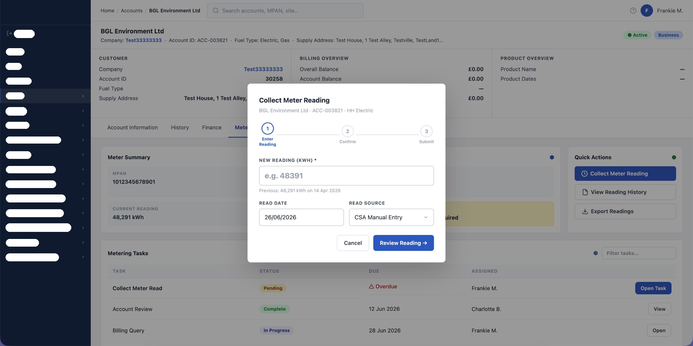
App 1 — Collect Meter Reading modal within the existing tabbed layout
App 1 — the constrained fix. Keeps today’s tabbed layout but adds what was missing: an overdue status, a clear stepper, previous-read context and an honest primary action. Built with real design-system tokens pulled live via the Figma connector. (Dummy test account data shown.)
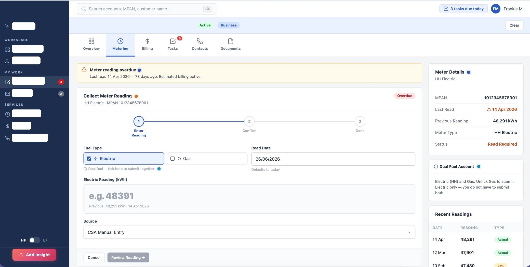
App 2 — greenfield Collect Meter Read view
App 2 — the greenfield optimal flow. Designed through the lens of “Frankie”, the frontline-agent persona: no tabs constraint, a prominent context panel, a dual-fuel indicator, recent readings inline, and the overdue state surfaced up front. (Dummy test account data shown.)

Spotlighted Fixes

Now vs Next

Every finding was evaluated against a combined framework — Nielsen’s 10 usability heuristics cross-referenced with a seven-principle model — then annotated directly in-app. Findings were split by how to act on them: quick wins to ship now, and systematic changes to route through the roadmap and change management.

Now — Quick wins
  • Overdue status not surfaced on the tile — agents calculated it by hand. H1 · Visibility
  • Missing task-count badge on the Metering tab. H1 · Visibility
  • No feedback on task save. H5 · Error prevention
  • Ambiguous “Continue” label at the decision point. H6 · Recognition
Next — Strategic
  • Filter inconsistent across tabs — agents tab-switched to find tasks. H4 · Consistency
  • Task-UI wrapper broken for all task-routed flows. Systemic
  • Duplicate / mismatched tiles across domains. Systemic
  • No journey diagram for the billing-exception flow. Coverage gap
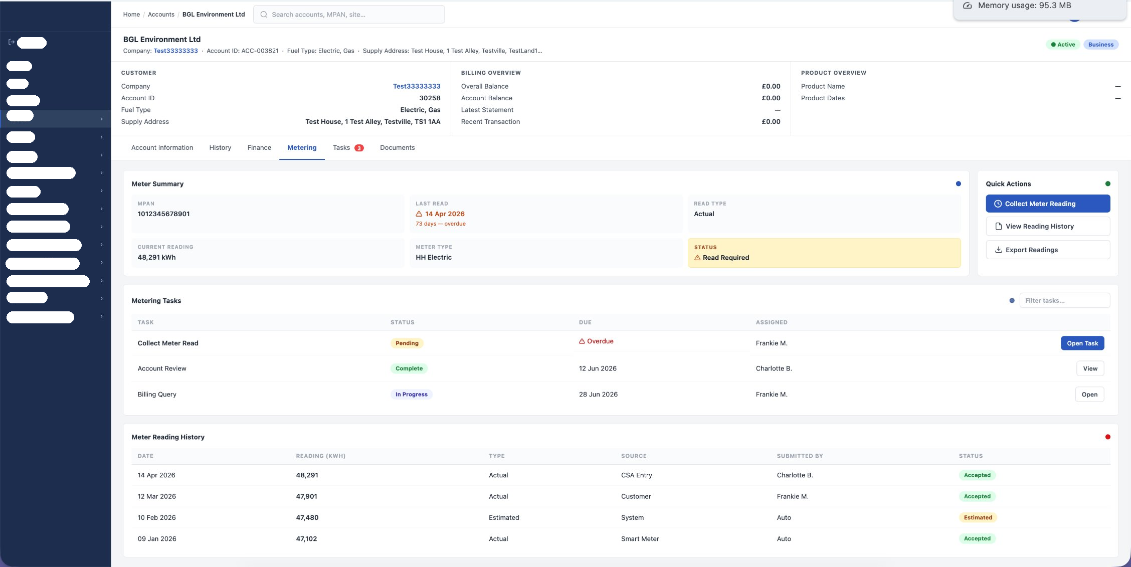
App 1 overview — overdue status surfaced, read-required flagged
Findings didn’t stay in a document. The quick wins landed straight in App 1 — the overdue read surfaced with a status, “Read Required” flagged, task counts visible on the tab. Each was tied back to a specific heuristic so reviewers saw the why, not just the what. (Dummy test account data shown.)

What It Changed

The impact

Beyond the specific fixes, the audit changed how the work gets done. It replaced opinion-led debate with a shared, evidenced basis for prioritisation — and drew a clean line between cheap improvements to ship immediately and structural changes to manage through a roadmap.

It also established a repeatable, AI-assisted method that a single designer could run and a whole team could trust: the operating foundation for maturing a business-design effort into a scalable research & design function.

Process efficiency
A two-week audit turned into a template, not a task — the next one starts from a running system, not a blank page.
Data-led decisions
Prioritisation grounded in behavioural evidence, cross-checked with qualitative research.
Team collaboration
A single playback that lets design, research, product and engineering act from one source of truth.
Product health
A precisely located bottleneck — the highest-leverage place to lift completion on a daily, high-volume task.
Next case study
FullStory Programme →
← All case studies